The cmyk color models
Reading these color charts
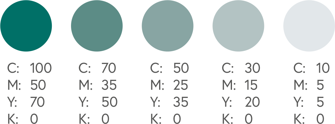
Some colors are much more challenging to reproduce perfectly in print. The charts below contain a series of CMYK colors that are known to be reliable for offset printing.
While we cannot offer exact color matching, we can recommend these relatively safe choices for your designs. Using these charts will help you achieve greater consistency in accurate color reproduction.
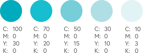
The ‘base’ color is displayed on the left of each row. As you progress to the right, the color values decrease gradually. The lower rows in each chart show secondary colors.
Please note that your monitor settings may affect what you see on your screen vs. the finished product from a printer. Inkjet or laser printers may also produce varying results based on settings. If precise color is vital to your project, we recommend that you purchase a proof of your print job to see exactly how it will look in print.
The CMYK color model
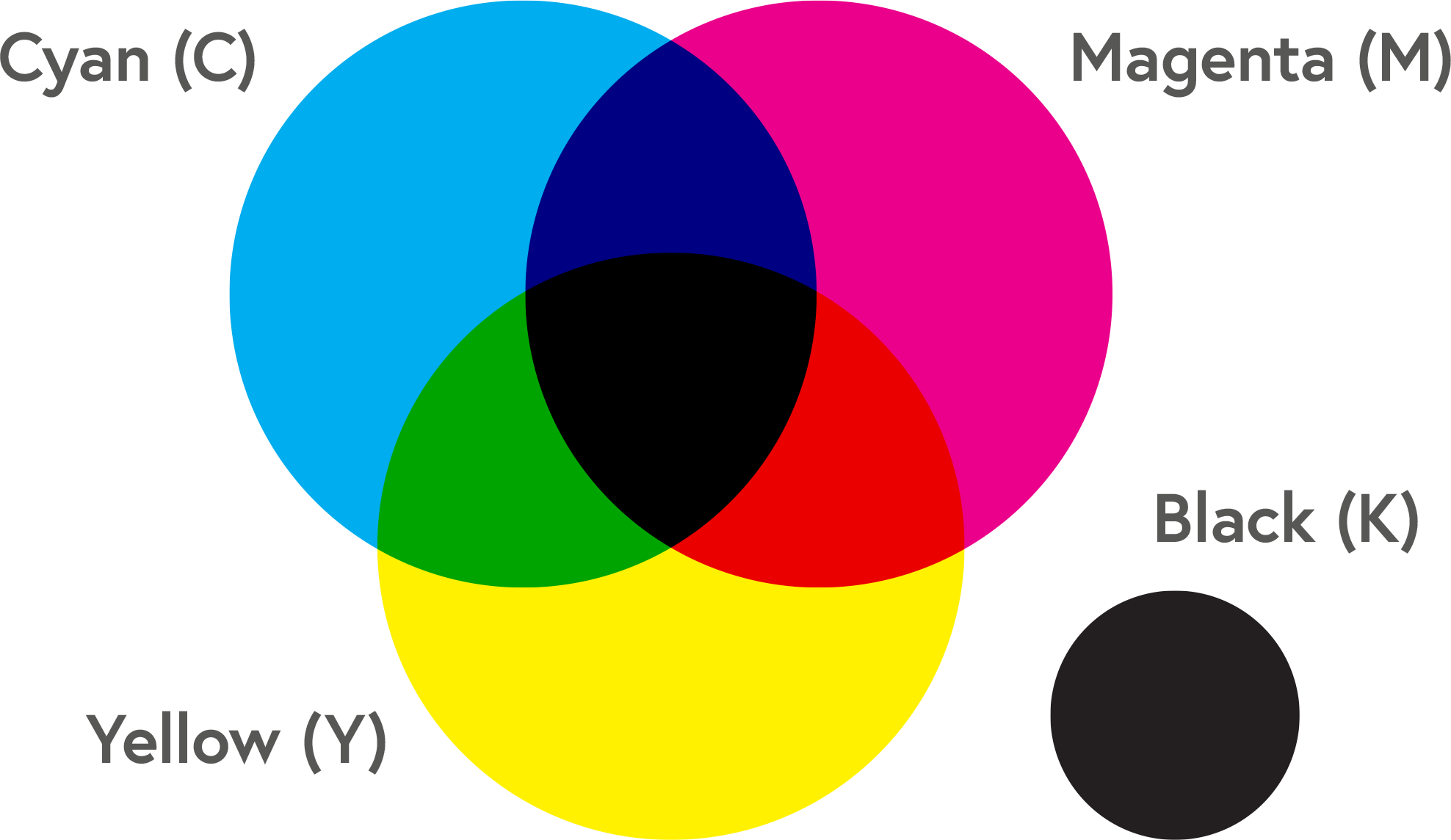
CMYK black
Standard black (the K in CMYK) is essentially made from shades of grey. How black the black looks is based on density, on a scale of 1 to 100.
Rich black is created by blending all of the CMYK colors, resulting in a more rich and saturated tone. Make sure not to over-saturate the paper by setting all colors to the 100 maximum. For best results, try some of the values shown in the chart below.
Remember, you should always be careful when using black to make the colors darker. It can easily make your colors appear muddy.
Read our black vs. rich black guide
Just blackRich black

CMYK reds
Red can often appear orange or rusty when printing. When this happens, you need to look at your levels of magenta and yellow. If your red looks too pinkish, you have too much magenta in the mix. If you see a more orange tinge, that’s because the yellow value is too high.
Remember, you should always be careful when using black to make the colors darker. It can easily make your colors appear muddy.


CMYK oranges and browns
Getting a nice, bright orange is easy: it’s two parts yellow, one part magenta (0-50-100-0).
Changing the balance of these colors will produce mossy greens, a ruch rust color, or earthy browns.
Remember, you should always be careful when using black to make the colors darker. It can easily make your colors appear muddy.
CMYK yellows and greens
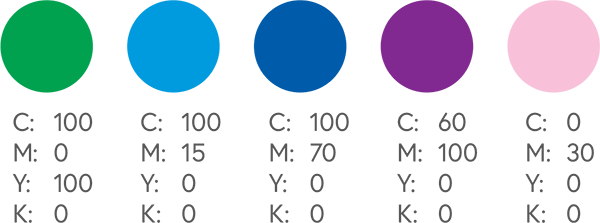
Cyan and yellow combine to make lovely green colors. For the most vibrant results, use them in equal parts and make them dense.
Be careful when making yellow itself darker–it can easily become more of a mustard color. In dense yellow mixtures, the finished color can look more orange or green.
Remember, you should always be careful when using black to make the colors darker. It can easily make your colors appear muddy.


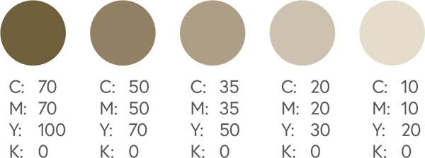

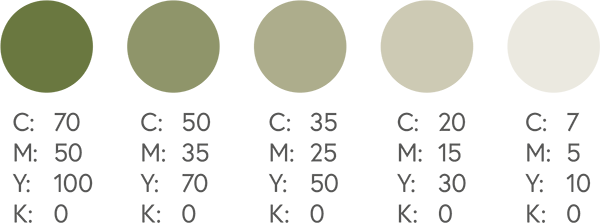
CMYK yellows and greens
Cyan and yellow will produce a lovely green color. For the most vibrant results, put them in equal parts and make them dense. As for yellow itself, be careful when making it darker. It can easily become more of a sage or mustard color. In dense mixtures, it can become more orange or green.
Remember, you should always be careful when using black to make the colors darker. It can easily make your colors appear muddy.


CMYK blues
In CMYK, blue is one of the most difficult colors to reproduce accurately. To get the color you want, it’s best to use even and balanced mixtures, like 100-50-0-0. Otherwise, you’ll get more purple or green colors.
Remember, you should always be careful when using black to make the colors darker. It can easily make your colors appear muddy.


CMYK purples
Regal purple tones are CMYK friendly. A 3:2 magenta to cyan ratio is an excellent place to start (79-100-0-0).
Remember, you should always be careful when using black to make the colors darker. It can easily make your colors appear muddy.


CMYK pinks
Pinks in CMYK printing are all about the magenta. To make your pinks really pop, the magenta levels should be high, and the yellow, cyan, and black very low. If you put too much yellow in, you’ll get more red hues. Too much cyan, and it’ll turn purple.
Remember, you should always be careful when using black to make the colors darker. It can easily make your colors appear muddy.


CMYK golds
True metallic gold finish is not possible with CMYK printing, but a flat or NMM (non-metallic metal) representation of gold can be produced. Some examples are shown below.
If you want a true metallic finish, you will need to use a metallic Pantone spot ink to your design.
Foils are also available for some products.
Remember, you should always be careful when using black to make the colors darker. It can easily make your colors appear muddy.


CMYK silvers
Just like gold tones, a metallic silver finish is not possible with CMYK printing. Flat or NMM (non-metallic metal) colors are possible, and are shown in the chart below.
If you want a true metallic finish, you will need to use a metallic Pantone spot ink to your design.
Foils are also available for some products.
Remember, you should always be careful when using black to make the colors darker. It can easily make your colors appear muddy.


CMYK bright colors
Want your colors to really jump off the page? Although CMYK can never quite reach the backlit-brilliance of RGB colors, the color mixes below will ensure the most vivid results for your printed products.


Post a Comment